BUILDING ON SUCCESS
Lane End is the market leader in the construction and housing sector in the North West. We worked with them for over two years, transforming their existing brand and creating a new visual identity that stood out from their industry competitors.
BRANDING
Transforming Lane End's visual identity not only to build new business but to reinforce the foundations of the company within.
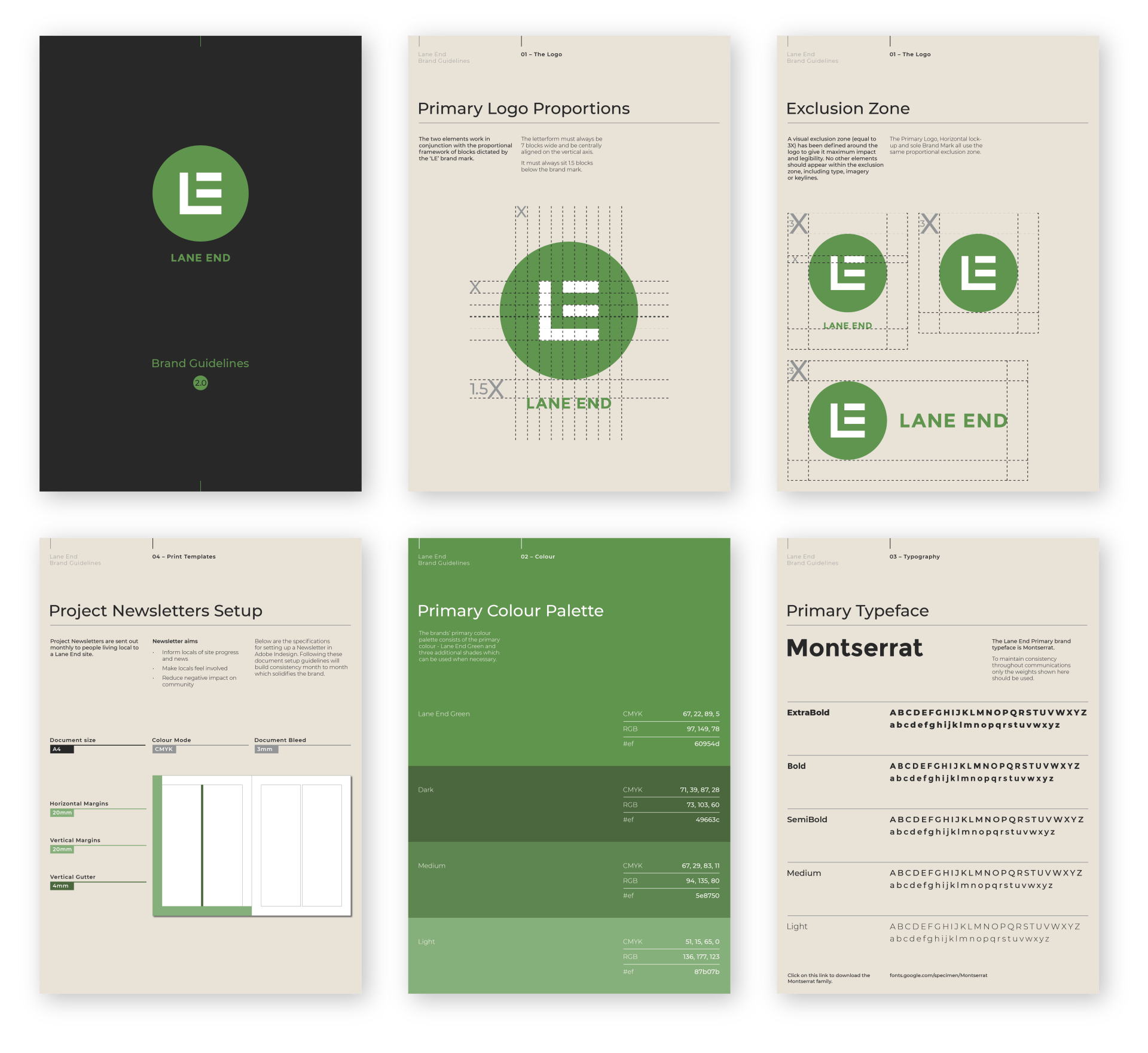
We overhauled their dated, inconsistent branding and created a fresh, contemporary design. This new visual identity highlighted the quality of both their services and their products.
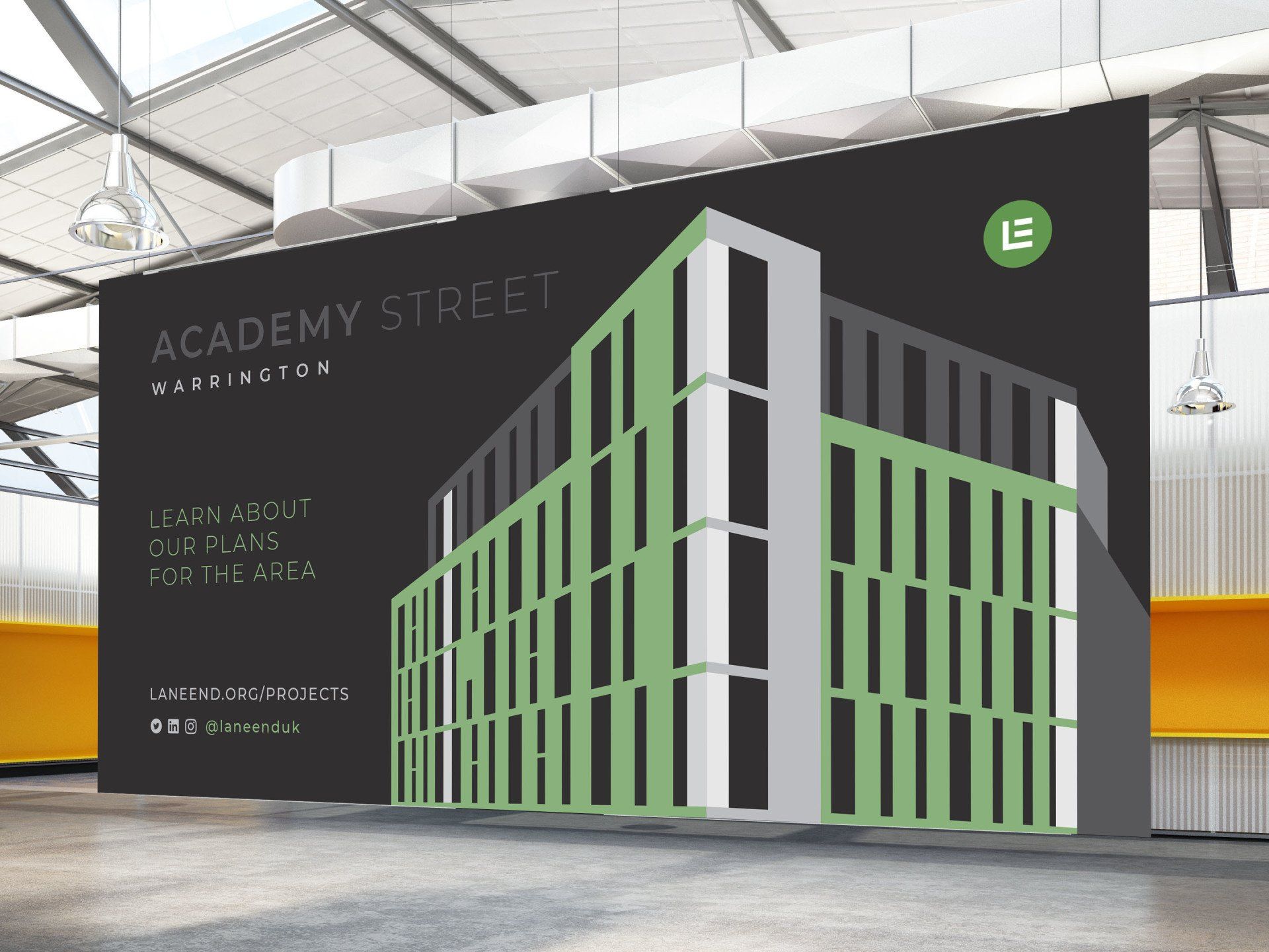
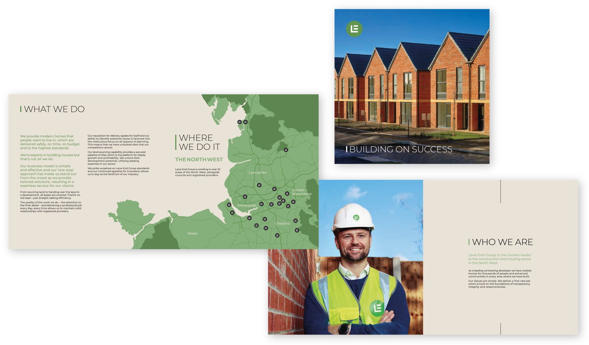
A key aspect for Lane End was its social footprint. When creating the new brand, we kept in mind the need to connect not just with the construction sector, but also with local residents in the communities around construction sites.
A powerful tool was our use of colour and the introduction of a range of soft greens combined with shades of grey to create something friendly and approachable but also strong and trustworthy.
There's nothing that gives me greater satisfaction than seeing a family enjoy one of the properties we spent a great deal of time, care and expert skill in building. We put the same pride and professionalism into every house we build.
DIGITAL
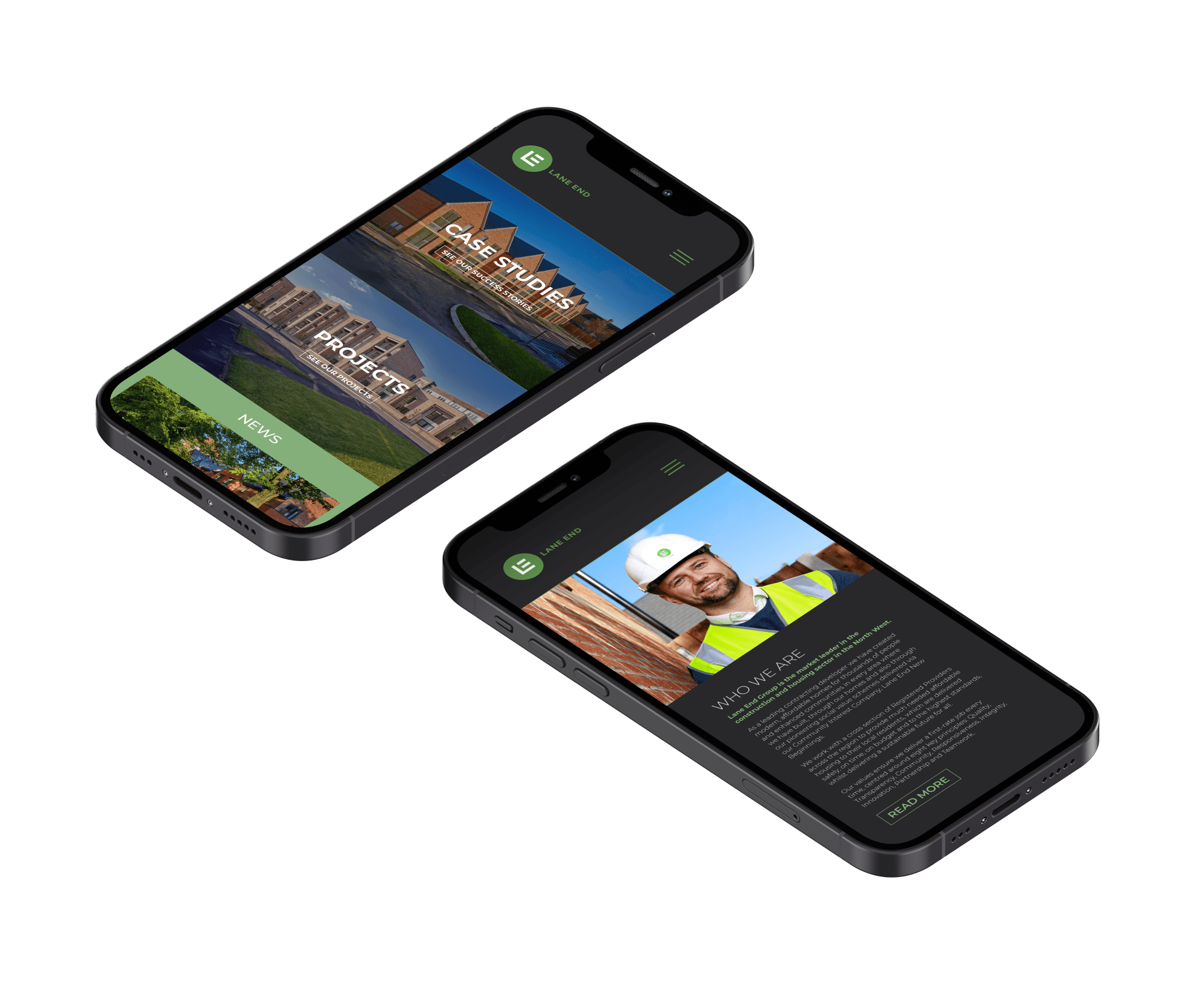
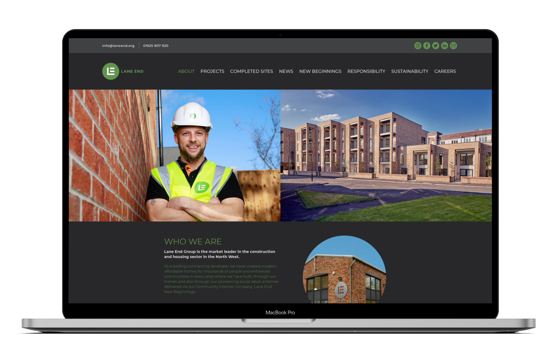
We designed a modern, fully responsive site for Lane End. On a professional level, the site showcases a portfolio of completed sites, current projects and team members. Alongside this, we drew attention to their positive social impact, building trust and allowing them to connect with the community on a personal level.
PRINT MARKETING
As market leaders, it was crucial that their ongoing print marketing strategy and content creation reflected their quality of service.
Through ongoing consultations with the team, we redesigned all of Lane End’s print marketing so that it not only adhered to the new brand, ensuring consistency, but also appealed to both the construction industry and local residents.
We produced monthly newsletters to give information and updates on all Lane End sites so that locals felt involved in changes to their area and could see the positive impact construction would have in the community.
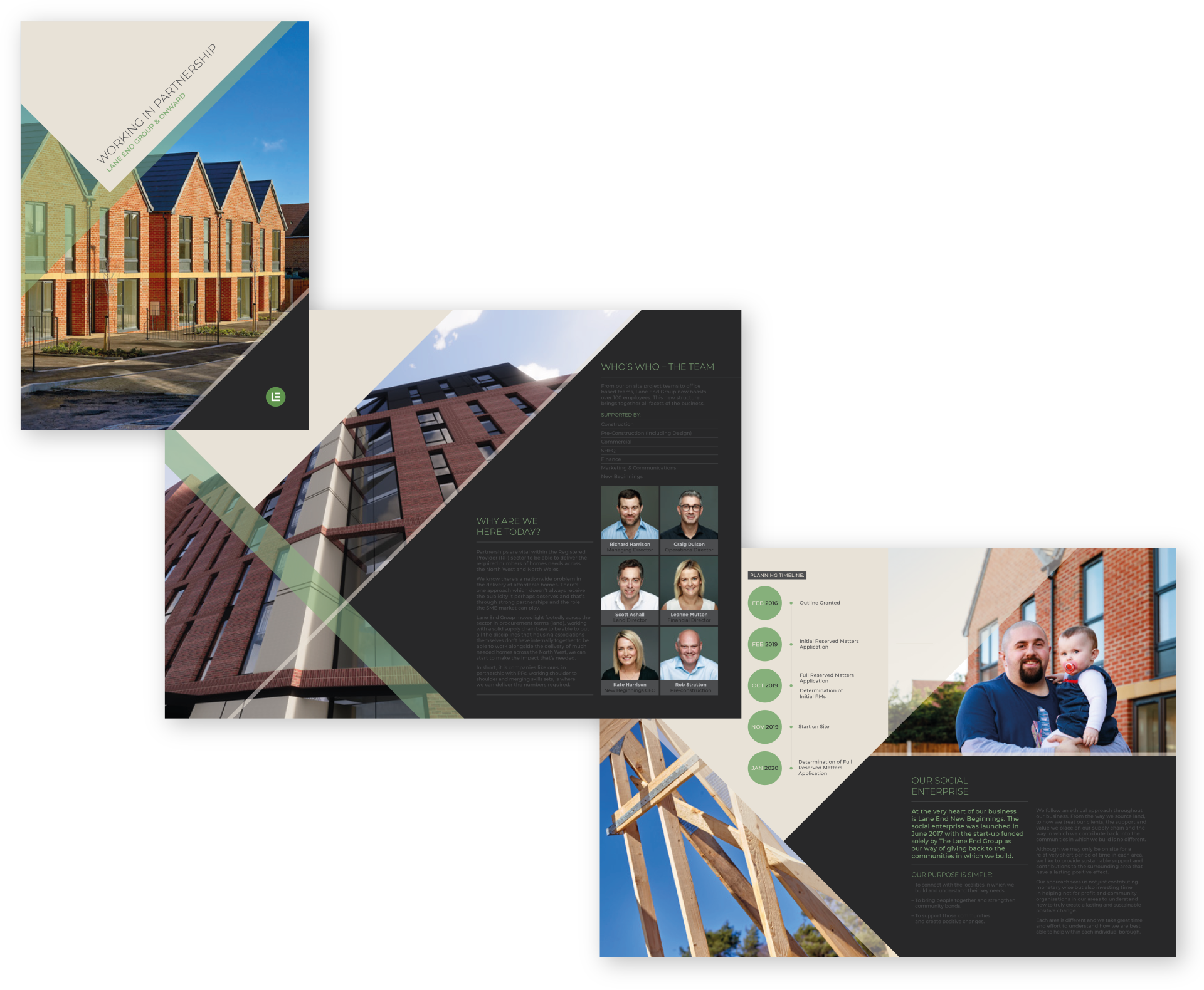
For Lane End it was important that their construction work could be showcased not only on their website but in a physical form. We created eye-catching brochures for potential investors, customers and corporate events, designed large scale construction site banners and branded uniforms, machinery and PPE.
It was also crucial that their team felt valued, connected and informed in everything Lane End so we created weekly news bulletins to be distributed internally for all members of staff. This was only one aspect of their visual identity changing within. The re-brand coincided well with the completion of their new HQ. We took this opportunity to implement the bold and confident new style in everything from a giant metal logo at the main entrance to branded stationary and office furniture.
PHOTOGRAPHY
We worked alongside talented photographer
Neilson Reeves to discover perfect perspectives of architecture, construction workers, locals in the community and the Lane End team.